Brief
A 3,240-row production QC dataset — 16 process metrics per batch (cost, supplier quality,
delivery, maintenance, downtime, inventory, safety, energy and additive-manufacturing fields)
alongside two defect signals: a continuous DefectRate and a binary
DefectStatus pass/fail flag. The question: which of those 16 metrics actually
predicts whether a batch gets flagged defective, and how much of that could be caught before
shipment using a model built on process data alone.
Cleaning
QA pass across all 17 fields: df.isna().sum() returned zero missing values
anywhere, df.duplicated() found zero duplicate rows, and every column loaded as
numeric already (12 float64, 5 int64) — no categorical encoding
needed before modelling. Every field's observed min/max also matched the ranges in the
dataset's own documentation (e.g. quality score 60–100%, supplier quality 80–100%,
maintenance hours 0–24/week), so nothing looked mis-scaled or out of bounds. Per that same
documentation this is a synthetic dataset generated for educational use, not a live factory
feed — worth keeping in mind for how much weight to put on the "why," not just the "what."
Data profile
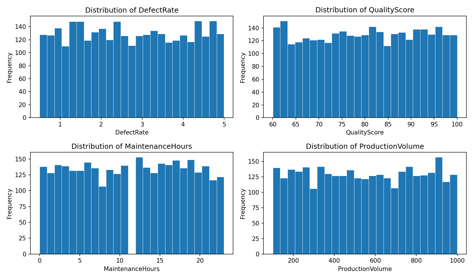
Descriptive statistics for all 16 process fields. The standard deviations run close to what you'd expect from a uniform spread over each stated range rather than a bell curve — the same pattern visible in Fig 1 below, consistent across the board.
| Field | Min | Mean | Median | Max | Std dev |
|---|---|---|---|---|---|
| ProductionVolume | 100 | 548.5 | 549.0 | 999 | 262.4 |
| ProductionCost ($) | 5,000 | 12,423 | 12,405 | 19,993 | 4,308 |
| SupplierQuality (%) | 80.0 | 89.8 | 89.7 | 100.0 | 5.8 |
| DeliveryDelay (days) | 0 | 2.6 | 3.0 | 5 | 1.7 |
| DefectRate | 0.5 | 2.7 | 2.7 | 5.0 | 1.3 |
| QualityScore (%) | 60.0 | 80.1 | 80.3 | 100.0 | 11.6 |
| MaintenanceHours | 0 | 11.5 | 12.0 | 23 | 6.9 |
| DowntimePercentage (%) | 0.0 | 2.5 | 2.5 | 5.0 | 1.4 |
| InventoryTurnover | 2.0 | 6.0 | 6.0 | 10.0 | 2.3 |
| StockoutRate | 0.00 | 0.05 | 0.05 | 0.10 | 0.03 |
| WorkerProductivity (%) | 80.0 | 90.0 | 90.1 | 100.0 | 5.7 |
| SafetyIncidents | 0 | 4.6 | 5.0 | 9 | 2.9 |
| EnergyConsumption (kWh) | 1,001 | 2,988 | 2,997 | 4,997 | 1,153 |
| EnergyEfficiency | 0.10 | 0.30 | 0.30 | 0.50 | 0.12 |
| AdditiveProcessTime (hrs) | 1.0 | 5.5 | 5.4 | 10.0 | 2.6 |
| AdditiveMaterialCost ($) | 100 | 300 | 300 | 500 | 116 |
Exploring the data
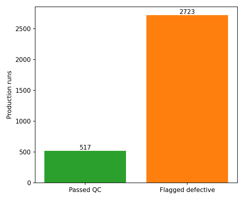
The four fields most relevant to quality — defect rate, quality score, maintenance hours and production volume — each spread fairly evenly across their stated range rather than clustering anywhere. The outcome itself doesn't: 84% of batches (2,723 of 3,240) are flagged defective against 16% (517) passed. That skew is by design, not an artifact — the dataset's documentation notes defect cases were deliberately oversampled since they're rare in real production, with non-defect cases added afterward for balance, and it flags the result as imbalanced and worth correcting before modelling. The Random Forest below uses class weighting for that reason rather than training on the raw 84/16 split.
What correlates with a defect flag
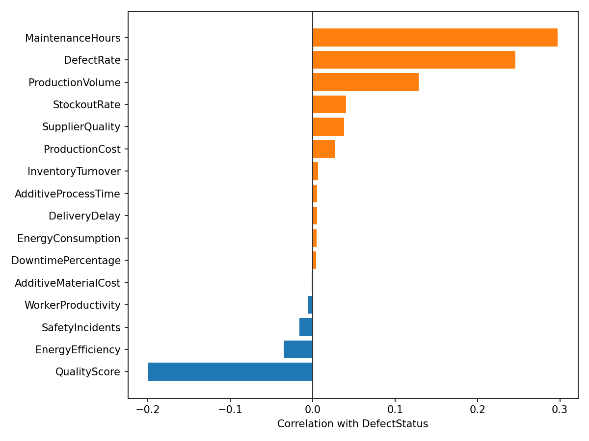
Most of the 16 process metrics show next to no relationship with whether a batch got
flagged: supplier quality, downtime, worker productivity, energy efficiency, safety
incidents and delivery delay all sit under |r| = 0.05 — functionally noise.
Only four stand out: maintenance hours (r = 0.30), defect rate (r = 0.25, expected
since it's the same signal in continuous form), production volume (r = 0.13) and quality
score (r = -0.20).
Predicting defects with a model
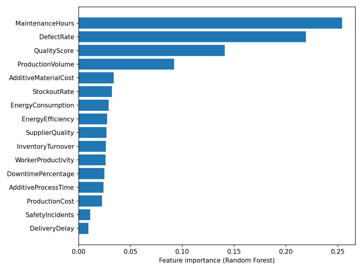
A Random Forest trained on all 16 fields reached 95.1% accuracy on a held-out 20% test split (648 batches) — 95% precision and 99% recall on "Defective," but only 73% recall on "Passed QC," reflecting the class imbalance: the model is far more confident flagging a bad batch than clearing a good one.
The maintenance hours pattern
The single strongest signal runs the opposite way you'd expect. Batches that passed QC logged a median 6 maintenance hours; batches flagged defective logged a median 13 — more than double.
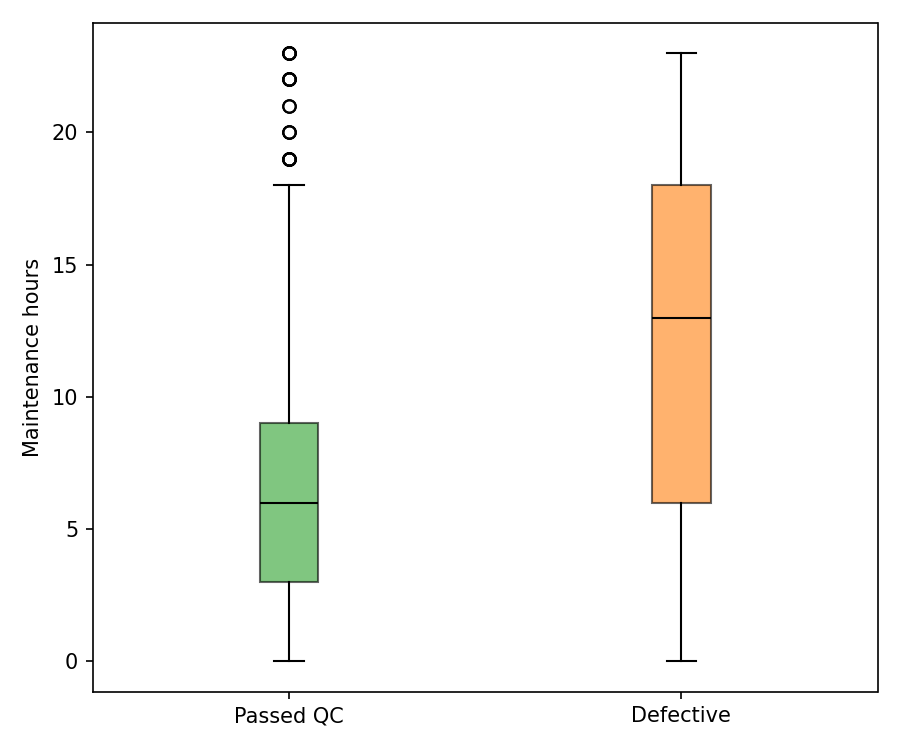
More maintenance is coinciding with more defects, not fewer — which reads like reactive servicing recorded around already-troubled batches rather than preventive upkeep paying off. Worth testing directly rather than assumed, by separating scheduled from reactive maintenance in the underlying data.
Where this points
- 01 Maintenance hours, defect rate and quality score are doing essentially all the predictive work — a lightweight alert on those three would likely catch most at-risk batches without needing the full model.
- 02 The maintenance-defect relationship needs a causal read, not just a correlational one — tag maintenance events as scheduled vs. reactive before concluding more upkeep helps or hurts.
- 03 Supplier quality, worker productivity, downtime and energy metrics show no measurable relationship to defect outcomes here — worth confirming they're captured at the right granularity before ruling them out as levers.
- 04 With 84% of batches flagged, the QC threshold itself may be the bigger lever — worth revisiting before assuming every flagged batch reflects a genuine failure.